Lesson 5: Syntagmatic Analysis
Spatial Relations
based on "Formal Picture Analysis", created by Lise Mark http://www.sprog.asb.dk/lma/index2-en.htm
|
Class assignment (individual work, checked orally as group discussion):
Read about possible spatial relations in painting and apply the obtained knowledge to analyze the picture by D.Hockney.
COMPOSITION
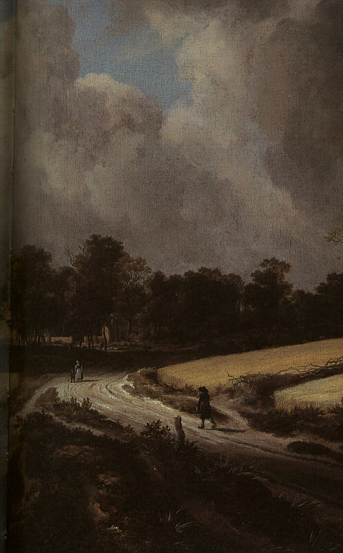
Horizontal composition
This compositional pattern is typically used in depictions of open landscapes.
Example
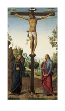
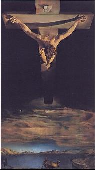
Vertical composition
Vertical lines create a strong sense of order and stringent structure if they dominate the picture plane. Their distribution across the picture plane can, however, create very different effects. For example, if a vertical line is placed along the central axis of a picture, the result is a symmetrical composition, signaling immobility and perhaps even eternity.
Example
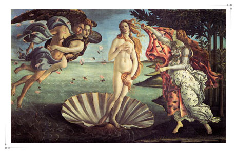
Circular or circular arc composition
The circle is especially used to emphasise divinity, eternity or plain rhythm.
Example
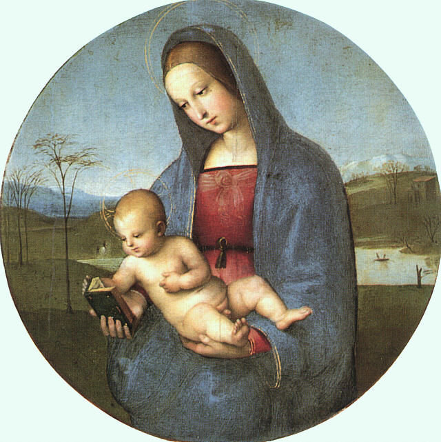
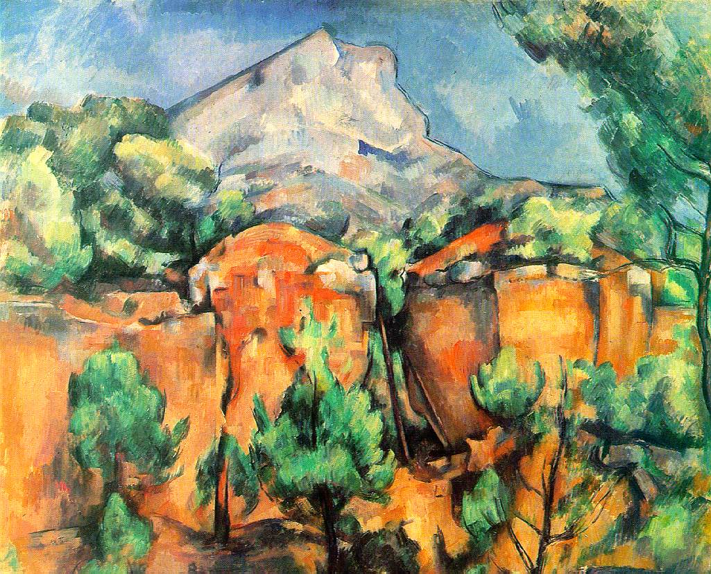
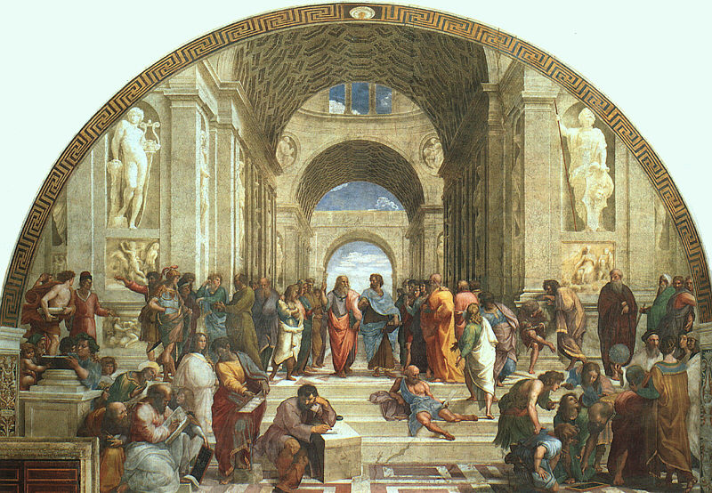
Triangular/pyramidal composition
Both the isosceles triangle and the equilateral triangle connote harmony or even divinity.
Example
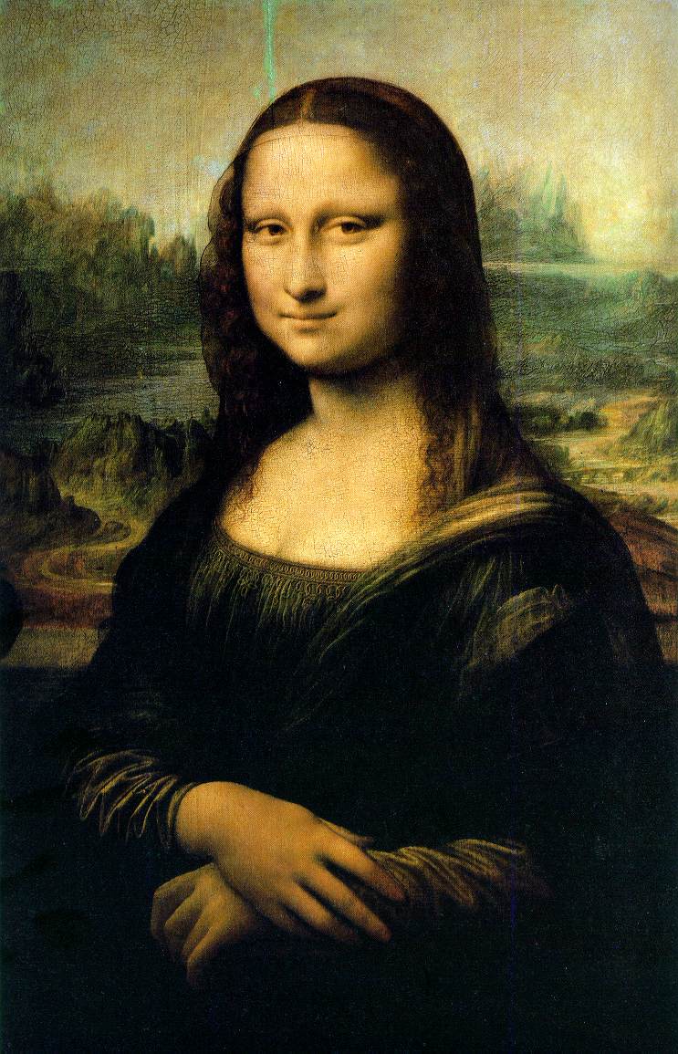
The Golden Section
A mathematical
definition of the divine proportion of the Golden Section:
In the diagram below there are TWO lines, namely
AC (the red line) and
CB
(the blue line).
When seen as ONE line called AB
(the red + the blue line), the proportion between the length of AC
and CB is defined
as the the divine proportion.
The point C is therefore the Golden
section

This (divine) proportion between AC
and CB is the
exact equivalent to that of AB
and AC.
”The Golden Section” is a compositional principle that has interested philosophers and artists for thousands of years and which has been believed for centuries to possess a certain unrivalled beauty and harmony.
Example
Cropping - "visual synecdoche"
The signifier is the fragment and the signified is the person, object, place or concept to which the fragment refers.
Example
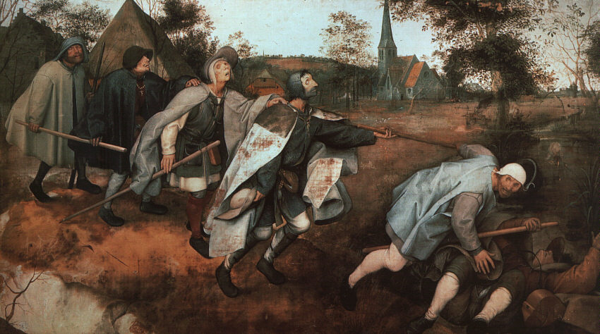
DYNAMIC/DISHARMONIOUS COMPOSITIONAL PRINCIPLES: Dynamic balance
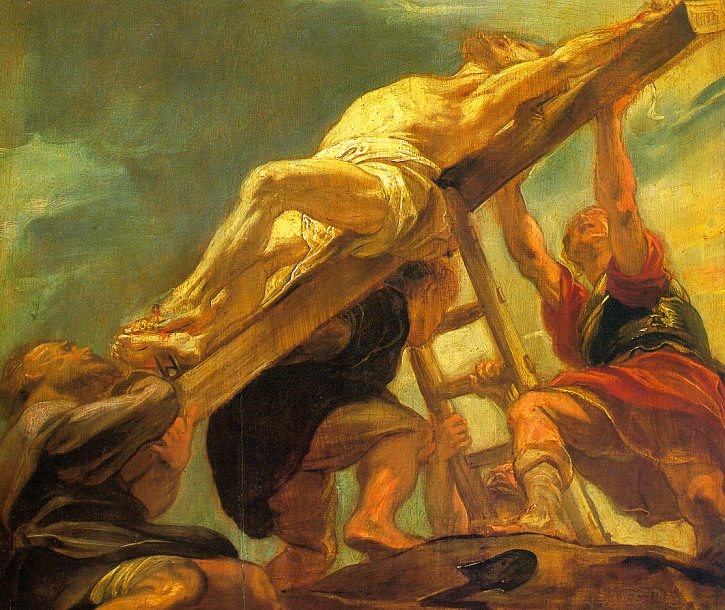
Diagonal composition
In an image, the diagonal typically emphasises drama, movement or depth, which means that the diagonal works in both two and three dimensions.
Example
Oval composition
If the oval is placed diagonally in the picture plane it tends to intensify the expression of drama and movement because its length axis becomes diagonal rather than horizontal/vertical.
Example
Hyperbolic composition
The hyperbole combines the movement of the straight diagonal with the rhythm of the
circle/circular arc.
When it follows the reading direction (from left to right) in a descending manner, it often suggests a continuous, rhythmical time sequence or time span.
Example
UNSTABLE COMPOSITIONAL PRINCIPLES
Such compositions typically employ many tilted, twisted or staggering lines, and will to a higher degree disturb or even provoke the natural sense of order and harmony that the human eye is said to search for.
Example
Composition and movement
Static versus dynamic balance
Shapes that have been dislocated from their resting or balanced zero position seem dynamic and in movement.
Example
SPACE: creating a perfect illusion of three dimensions
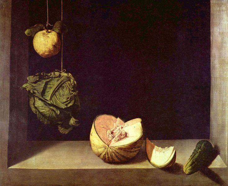
Overlapping
Overlapping creates a very limited depth, and emphasises the flatness of an image.
Throughout art history, it has typically dominated in art that has had an explicit wish to move beyond reality, either into the religious (heavenly) sphere or just into pure visual abstractions of colour and form.
Example
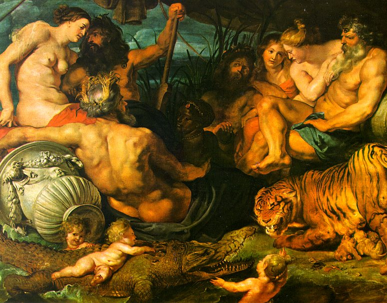
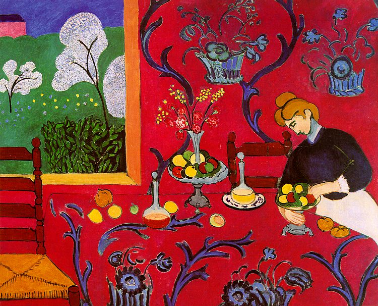
Repoussoir
In contrast to the technique of overlapping the repoussoir technique creates an explicit sense of depth in an image.
The name stems from French and relates to the idea of “pushing something backwards”, and it refers to pictorial elements/objects which are deliberately placed in the foreground to create the illusion of immense distance between one or more depth planes of a picture.
Example
Shading/hatching
Shading (hatching) creates
- volume
- plasticity
- depth.
Furthermore, it allows us to
- determine from which point an
object is illuminated
- define its volume by use of light and shade
- to place that object firmly on the ground.
It is therefore a very
realistic representation of space and three-dimensionality.
Example
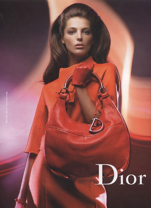
Colour perspective
Cool colours, e.g. a greyish blue, are perceived as being further away from the viewer than are warm colours such as e.g. reddish/orange hues, which tend to force themselves forwards to the foreground of a picture and thereby appear closer to the viewer.
Example
Normal colour perspective vs. reversed colour perspective
 Linear perspective
Differences in size can, of course, also be perceived as space and distance. The size of objects in an image, which is constructed by means of linear perspective, can be determined mathematically correct by means of diagonal lines directed inwards to meet in the so-called “vanishing point” in the horizontal line.
In the centralised linear perspective pictorial space is typically balanced, harmonious, symmetrical and static. This creates a comforting overview for the viewer who may feel the (s)he is present in – or even in control of - the pictorial space.
Example
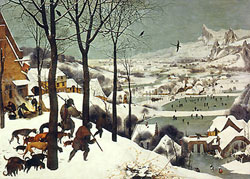
"Raumflucht"(“spatial flight”)
If the vanishing point is dislocated, so is the overall sense of balance, symmetry and order, and the result is lack of order and overview, and thus a much more dynamic if not chaotic spatial representation.
The effect of this type of spatial representation is lack of harmony and a lot of drama, depending on how far the vanishing point is moved from the centre of a given image. The sense of space and spatial extension, however, becomes accentuated.
Example
VIEWPOINT - VISUAL ANGLE: The relationship between viewer and viewed.
Bird's-eye view
a. Looking straight ahead from an elevated position. Looking straight ahead from an elevated position.
b. Looking down from an elevated position Looking down from an elevated position
Both these examples of bird’s-eye view leave the viewer with a feeling of overview, that is, of being in control.
Worm's eye view
a.Looking straight forward from a low position Example
b.Tilting one's head backwards, looking up Example
The worm’s eye view makes the viewer lose the sense of having an overview, that is, of being in charge of the scene.
Normal eye level view
The viewer is at level with the viewed, so that proportions are not distorted in any way. The horizon is at eye level, and the viewer is therefore "on equal terms" with that which is depicted. Example
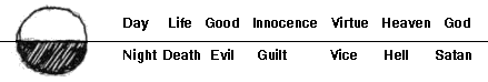
LIGHT & light symbolism
Symbolic light
The contrast between light and darkness, i.e. the black/white contrast is fundamentally symbolic. In many cases we tend to transfer the polarity of the binary opposition black/white to a realm of corresponding existential and moral binary oppositions.
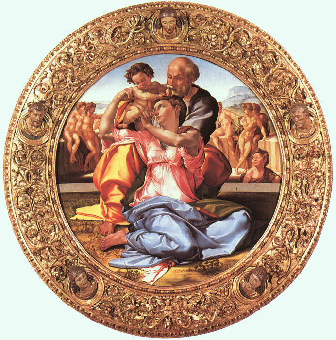
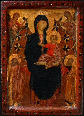
Radiating light power from a depicted object
“God is light” is a common saying.
Religious artists have often taken the consequence by claiming that precisely for that reason, divine objects or beings could not be illuminated as they were light sources themselves.
Subjecting a divine being to an external light source would mean acknowledging the existence of something bigger and more powerful than this being, and in religious art from the middle ages this would be heresy.
Precisely for this reason, religious icons from medieval times - as the one below - represents saints and holy beings on a background of pure gold, thus utilizing the reflective properties of that material for a religious purpose.
Example
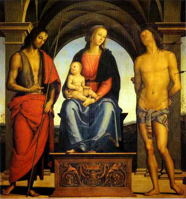
Modelling light (linear style)
Modelling light is an even and regular daylight which models figures and objects in a few smooth transitional zones of gradual transition between light and darkness.
Shadows are often one-sided only, and typically, a given object is circumscribed by a very thin and sharp contour.
Every object in a given image is equally in focus, equally visible and equally important, so a soft modelling light is a visual “democracy of forms”, leaving the viewer with a feeling of having an overview and being in control.
Example
Painterly light (painterly style)
a. Sfumato
As the root of the Italian term “sfumato” suggests, this lightening effect is characterised by a smoke-like quality, modeling shapes and objects very softly from strongly lit areas to almost pure black – just like a smoke screen tends to blur transitions.
Example
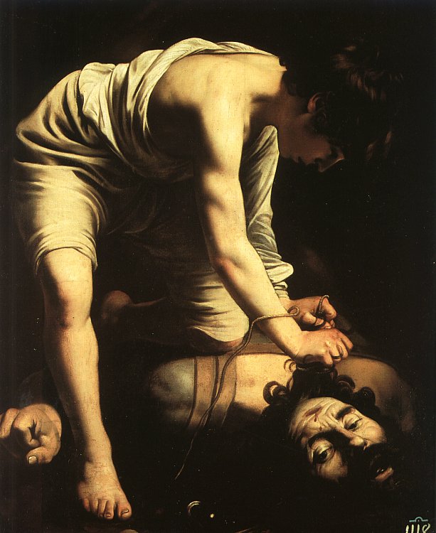
b. Clair obscur (chiaroscuro)
Clair obscur is a technique in which an external light source, functions as a sharp projector in an otherwise dark and indefinable space. Thus, Clair obscur is typically employed for selective or manipulative purposes, since the artist is in complete control of what is important and needs to meet the spectator’s eye.
During the religious struggles between Protestantism and Catholicism in the baroque era (17th ct.), clair obscur was the favoured technique of the catholic church painters, who employed the technique in their religious paintings to overwhelm and convince – perhaps even convert – the audience to the “proper faith”. The propagandistic quality of clair obscur is still utilized in public relations, marketing and advertising industry because of its highly manipulative effect.
Example
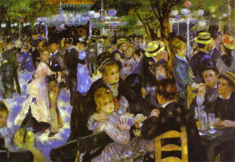
Impressionist light
Impressionist light emphasises the play of light in the tactile surface of an object. This play of light seems if not more important, then equally important to the object on which it plays.
In impressionist light depictions, pure light tends to break up the colours in complementary colour dots so that light and colours are united in a flickering unity, whereas form is only of secondary importance.
The use of impressionist light typically assigns great importance to surface, tactility and textural effect.
Example
COLOUR AND COLOUR RELATIONS
The spectral colours (intensity)
A special characteristic of all spectral colours is that they are the clearest, the purest and the most saturated colours that the human eye can possibly perceive.
The principle of colours that work well together is best illustrated by means of the colour circle by the artist and art teacher Johannes Itten from the design- and art institution BAUHAUS.
Note that in Itten’s colour circle, the primary colours and the secondary colours are located directly opposite each other.
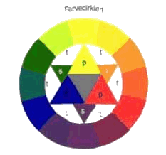
Johannes Itten's colour circle
P = primary colours (red, blue, yellow)
S= secondary colours (green, orange, purple)
T= tertiary colours (middle tones)
Achromatic (non)colours: black, white and grey
The achromatic white, grey and black are extremely important, partly in their pure quality, partly because they can be used to either strengthen or weaken the intensity of accompanying colours. The colour grey in its many tones is said to bring out the very best in other colours when functioning as background.
A Gucci screen saver.
Broken colours: (toning down colour intensity, while increasing subtlety of nuances)
The intensity of a spectral colour can be reduced by “breaking” it with achromatic colours or mixing it with its complimentary colour. When a spectral colour is broken, it will lose some of its intensity and saturation, but it will gain in richness of nuances. It is often a very good idea to use broken colours in visual presentations, because too many spectral colours tend to end up looking like a poster from an amusement park, diverting the viewer’s attention from any accompanying linguistic messages.


Different degrees of colour intensity: Neither extreme is realistic representation, but which is?
a. Breaking spectral colours with black and white
When colours are broken by adding black or white, the main colour hue stays the same but becomes darker or lighter. If white is added, for example, light intensity is strengthened. This is called a change in tone.

Spectral blue broken with white and black respectively.
b. Breaking spectral colours with their complementary colours.
When primary colours are broken by means of their complementary colours (the secondary colours) a similar thing happens; the intensity is weakened in favour of a colour spectre which is very much like earth colours.
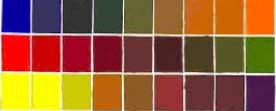
• Upper row: primary colour blue mixed with its complimentary secondary
colour, orange
• Middle row: primary colour red mixed with its complimentary secondary
colour, green
• Bottom row. primary colour yellow mixed with its complimentary
secondary colour, purple
Ambiguous colours (the "porn palette")
The "porn palette” is a common name for a colour expression which deliberately combines colours that do not naturally work well together in an attempt to provoke the eye by means of colouristic disharmonies.
Ambiguous colours in combination tend to create a rather psychedelic colour scheme, which - by the way - has been rather trendy the latest years.
Example 1, Example 2
In itself, each of the colours shown below is perfectly "normal”!
An example of a “porn palette” the COMBINATION

Mutual colour relations
a. The complementary contrast
If two complimentary colours are juxtaposed rather than mixed each colour activates and emphasises its complimentary counterpart’s special character.
As a result, a pair of complementary colours is in itself often sufficient to create a colourful and intense visual experience. Example

Complementary colour contrasts
b. Cold/warm contrast: temperature and colour perspective
That warm colours seem close and cool colours seem distant has already been mentioned in the section on space , “colour perspective”.
However, other associations are very often connected to colour temperature. For example, a warm colour can suggest intimacy and perhaps even cosiness, whereas a cool colour may suggest freshness, professionalism or distance. Example 1, Example 2
Colour specific density
If colours are to be balanced in a visual design, two colours should not always occupy identical amounts of space, because they have varying specific density.
The more light a colour radiates, the less space it needs to counterbalance a darker colour with less intense light radiation. This means that in an overwhelmingly blue picture, only a very little amount of e.g. orange is needed to create an overall sense of colouristic balance and harmony.
 
The principle of colour specific density at work
|
Resources for Lesson 5:
Chandler, Daniel. Semiotics for Beginners.
Student Essays (Daniel Chandler's course)
Brooks, Cleanth & Robert Penn Warren (1972): Modern Rhetoric (Shorter 3rd Edn.). New York: Harcourt Brace Jovanovich
Tolson, Andrew (1996): Mediations: Text and Discourse in Media Studies. London: Arnold
http://www.teamsputnik.co.uk/blog/CategoryView,category,Little%2BRed%2BPolitically%2BCorrect%2BRiding%2BHood.aspx
http://justfad.blogspot.com/2008_08_01_archive.html
Burr, Vivien (1995): An Introduction to Social Constructionism. London: Routledge
Larrucia, Victor (1975): 'Little Red Riding-Hood's Metacommentary: Paradoxical Injunction, Semiotics and Behaviour', Modern Language Notes 90: 517-34
Eco, Umberto (1966): 'Narrative Structure in Fleming'. In E. del Buono & Umberto Eco (Eds.): The Bond Affair. London: Macdonald
Woollacott, Janet (1982): 'Messages and Meanings'. In Gurevitch et al. (Eds.), op. cit.
|
Пермский государственный университет
|