Example 1
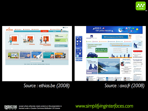
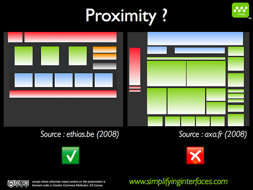
On the Ethias site, the spaces and the connection between the graphical objects have been studied in order to respect the principle of proximity, on top of the principle of similarity.
The AXA screenshot, however, shows the space between the objects is very small and that all objects intermingle as to create 3 groups. With less graphical elements, the Ethias screen has more groups.
Example 2
http://www.vanseodesign.com/blog/web-design/design-basics-proximity-to-know-what-belongs-with-what/Where We’ve Been
Proximity in the Sidebar
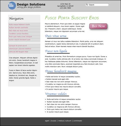
If you look at the image above it’s pretty clear that the content is grouped together and the navigation is grouped together and that each group is distinct from the other. We know where the header and footer begin and end and even have clues about what belongs together within each section of the design.Still there are areas of the design where you might question if certain elements belong together. Look at the navigation in the sidebar. You might have noticed our navigation shows a series of links followed by a space and then by another series of links.
Do all those links go together? Is that second series of links really a set of links? They look the same, but why the gap?
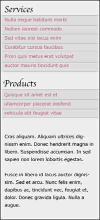
Let’s fix things so the navigation is clearer. I’m going to say the links do belong to different groups and introduce another heading.
Here’s how our new sidebar looks in the overall design.
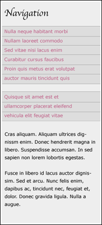
Notice the difference before and after we applied the principle of proximity. The difference is more subtle, but it’s now obvious the links, while related are somewhat different. In part it’s because we’ve added the extra heading, but it’s also due to the extra spacing we’ve place between them.
If we were to remove both headings, you’d probably still come to the conclusion that the groups of links were somehow different. The headings drive that home. Also notice how the Products heading is closer to the the product links than it is to the service links.
To emphasize things a little more I’ve also added a little more space between the product links and the text below. You likely weren’t going to confuse the text for links, but imagine it were a list instead of a paragraph. The extra space helps distinguish the that the text and links are not the same.
Proximity in the Main Content
Our sidebar is looking good, but what about our main content. Can we improve things there through the principle of proximity? I’m sure you know the question is rhetorical.
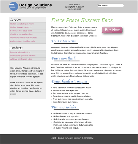
One thing we can do is something we just did in the sidebar. I mentioned how the Products heading is closer to the links it describes than it is to the links grouped under services. The headings and paragraphs in the content are currently evenly spaced.
Sure you’d guess that the heading describes the text below, but it doesn’t have to. What if were meant as a pull quote or if the heading was really the caption for an image. In those cases the spacing would play a large role in showing what goes with what.
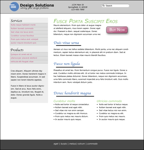
I’ve done a few things in the image above. First I’ve changed the spacing between the headings and the paragraphs. Headings now sit closer to the paragraph below than above. Again you would likely have understood which paragraph the heading referred to, but it’s much more obvious now.
I’ve added one more change to the last two content sections. Compare how the two bulleted lists look here as they did at the start. Earlier they sat one under another in the same heading/text relationship as the paragraphs above.
Were the lists describing something similar? Was it simply coincidence that they fell one after the other?
Consider how they look now and what the grouping tells us. Each list has it’s own heading so they are somewhat different. Yet both fall under the same major heading indicating that they are somehow related too.
Perhaps each list describes the benefits of your business. Maybe the list on the left is talking about your services and the one on the right is talking about your products. The major heading then might be Benefits and the lesser headings might be Services and Products.
A lot of information is communicated just by the way we’ve changed how the lists are grouped together.
Conclusion
While not as dramatic as contrast or alignment, proximity still adds visual cues to what’s happening in your design. Of all the four basic principles, I think proximity is the one that gets missed the most often. It’s more subtle in many cases, but no less important.
Think about where we started when this series began and what we’ve accomplished. Our initial design was amateur. It was barely a design and yet sadly you’ve probably come across many web pages and websites that has a similar design.
Without having to add much in the way of visual eye candy, we arrived at a professional design by applying a few simple principles. The only images we’ve used are for the call to action button and in the logo and each could be replaced by a non image design element easily enough.
Is this design great? Well, no, but it has crossed from amateur into professional which is what we set out to do. I hope you enjoyed this series and see how powerful a few basic principles can be.
Now that you know what these 4 basic design principles are you should be able to see them in practice as you travel around the web. Take note of them when you do. Notice how one site uses alignment and how another uses repetition. Watch how contrast calls out different design elements and look for how proximity is used to make a design more understandable and usable.